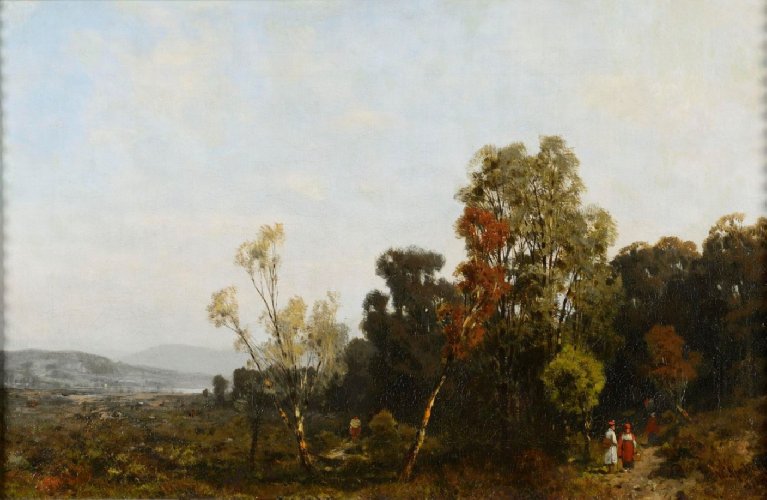
Description:
From the landscape studio of Christian Breslauer at the Warsaw School of Fine Arts emerged a younger, almost a generation younger, than Brodowski, Władysław Malecki (1836-1900), who studied there from 1852 to 1856. The landscape of the Vistula River was created during the artist’s eleven-year stay in Munich, where he went after completing his studies at the Warsaw School of Fine Arts and receiving a government scholarship in 1867. During his studies at the local Academy with Eduard Schleich, he became friends with the Gierymski brothers, Józef Brandt and Juliusz Kossak.
During his travels through the picturesque Bavaria and, after his return home, through Mazovia, Kielce, Krakow and Volhynia, he was looking for motifs for his landscapes, which constituted the main theme of his creativity. Although he exhibited a lot in the country, he enjoyed greater recognition abroad, where his almost staveless landscapes were understood, which, in their sketchy approach and investigation of color-light relations, were close to the painting of the French Barbizonists.
Description of the painting:
“Landscape of the Vistula River” is an autumn landscape with a stavel. The foreground was created with intense colors. In the lower right corner of the painting, two figures can be seen standing on the road leading into the forest. The man, facing away from the viewer, is dressed in a Krakowian dress and a red Krakusk, and has a bag slung over his shoulder. He seems to be talking to a woman also dressed in folk costume – a skirt with a red belt, a white shirt and a red cap on her head. Looking to the left, we see two spreading trees, next to which opens an open clearing. The narrow foreground is clearly separated from the hazy second, where the trees become blurred patches of dark greens, and the figures are recognized only by the outline and white-red color scheme. The work also distinguishes a third plan, visible at the left edge of the picture field. It is created by hazy, seen from afar, outlines of mountains and a river. The composition is divided by a central, horizontal axis into two zones. The upper one is made of shades of gray and blue with light outlines of clouds, the lower one is a landscape. The artist divides the picture not only horizontally, but also vertically. The right side of the landscape is closed by lush vegetation, while the left one, through the use of color perspective, gives depth to the work. In the painting, the so-called Munich sauces are dominant.


